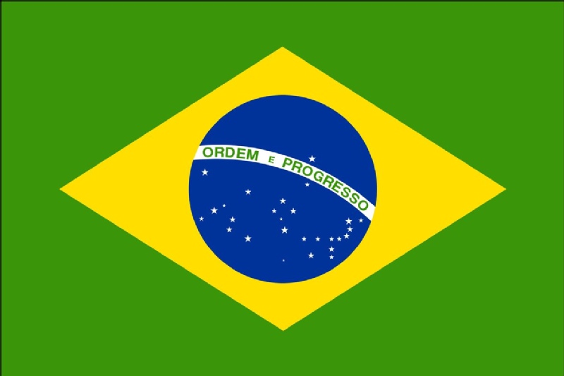
Vexillology and icon design
Vexillology – the study of flags. Yeah I can’t pronounce that word and neither can Roman Mars – the host of this cool little podcast called ‘99% Invisible’ that I stumbled across recently. The podcast talks about things like flag design, maps and various other interesting little nooks and corners of the design space. Here’s a summary of some of the main design guidelines: http://www.midcoast.com/~martucci/flags/designs/vexigrap.html
The talk on flags is interesting – because the same principles can and should be applied to many domains where clarity, distinctiveness and cultural neutrality is key – such as icons, buttons, logos etc…
It astonishes me how simple things like icon designs are often overlooked. Have a look at the dock of your average mac and observe the number of bluish roundish icons there are (what the hell is with this seemingly universal fixation with blue and round???) – and how few red squares, green diagonal lines etc… This frustrated me so much on a system I had a while ago I ended up downloading a bunch of icon packs and selecting things like the Starfleet logo for the photoshop icon – simply because – as a yellow triangle type shape – it was nicely visually unique.


 Address: 5 Day St, Marrickville, Sydney, Australia
 Phone: +61 2 (0) 404 214 889
 Email:
[…] mentioned in a post below the overwhelming dominance of blue-ish, squar-ish icons. It would seem that designers seem to […]